Interview with typographer and designer Filiep Tacq by Dirk Pültau
Translation: Dorrie Tattersall
First published in Dutch, in the Art Magazine De Witte Raaf, 2006
———
Dirk Pültau
—When did you first think: I want to make books?
Filiep Tacq
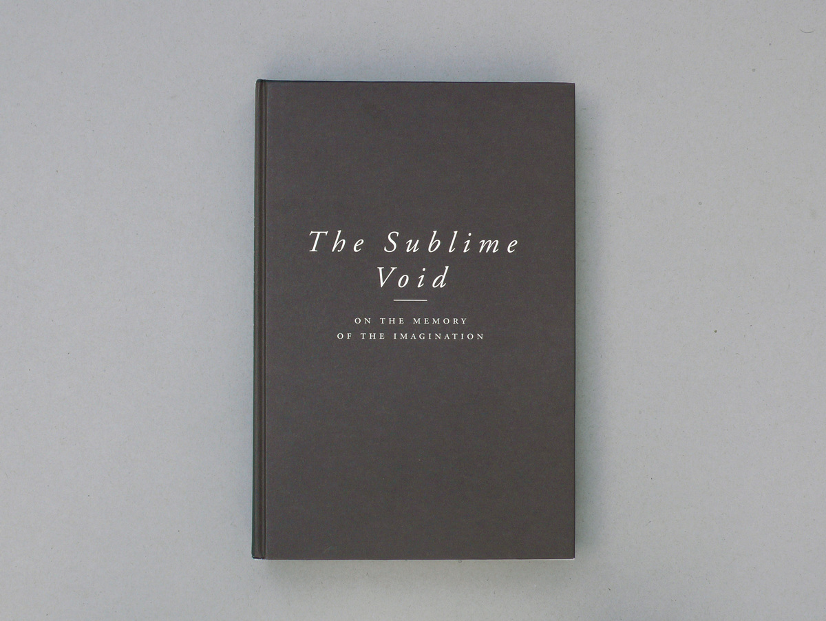
—In 1993 — when I made The Sublime Void together with Bart Cassiman. This was the book accompanying the exhibition of the same title in the Koninklijk Museum voor Schone Kunsten, in the framework of Antwerpen 93. That was my first serious book. In the decade leading up to 1993 I had made some small books and exhibition catalogues, for the Gele Zaal in Ghent and for the Deweer Art Gallery in Otegem. But I don’t regard those as real books. The realisation of the book only came to me in 1993.
—What was it exactly that you realised then?
—That a book is a space, too. That you can tell a story with images in a book. Just like you can do an exhibition in a building, you can make something like an exhibition in a book. I only realised this in 1993, with The Sublime Void. That was the first time I had a partner to discuss a book with – because my best books have been made in collaboration, often with the artist and the publisher.
—The cover of The Sublime Void is brown, with letters in off-white. The back flap is just a brown plane.
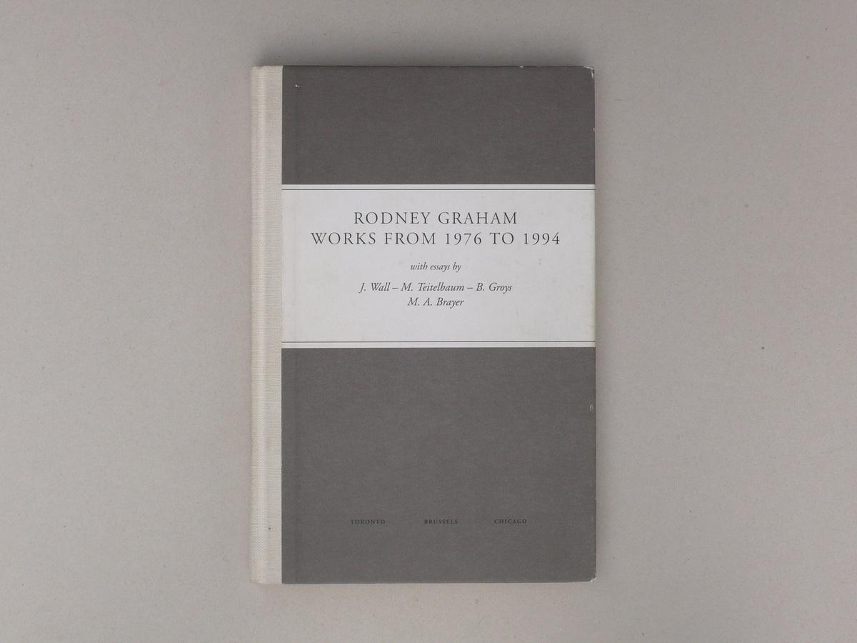
—That is a weak aspect: I didn’t do anything with the back flap. A cover is an alliance of front, spine and back. In order to design the cover, you have to lay open the book, outside up. In the case of Works from 1976 to 1994, my first book with Rodney Graham, made for publisher Yves Gevaert, I understood this. The cover of that book is taken as a whole, with a half-linen band — which is a reference to technical study books.
—Which ideas do you take as your starting point when designing the cover?
—I don’t like covers with images, although there is a constant demand for it nowadays. I like to use colour. So I prefer working purely typographically.
—Could you describe the impact of colour on a cover?
—Colour lends a book materiality; a book does not just get its materiality from the actual materials – a hard or soft cover, linen or cardboard – but also from the use of colour. A white book has a different feel to a red book. I often think of the skin of a building when I think about covers. I want the book to have its own skin.
—Hence your preference for typographical covers? Because they maintain the skin of the book?
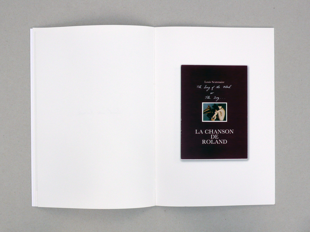
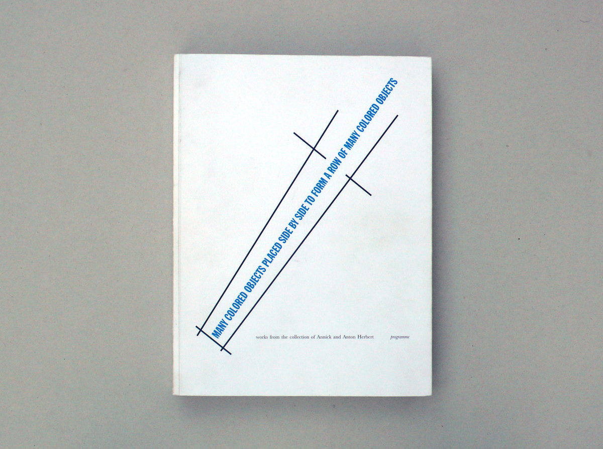
—Let me give you an example. For the catalogue of the Herbert collection in the Casino de Luxembourg I was asked to use an image for the cover: a design drawing by Lawrence Weiner for the re-installation of his work Many Colored Objects, on the front of the Casino. I thought the image was unsuitable, and asked Weiner: ‘Why don’t you make a sepatate version for the front of the book?’ He took this suggestion up with enthusiasm.
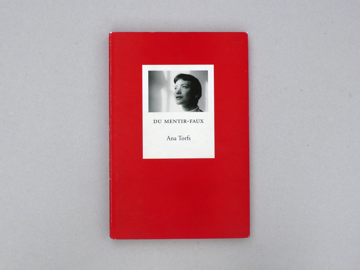
—When you choose the colour for a cover, do you also think about effects of meaning? Take the book Du Mentir-Faux by Ana Torfs. You chose a rather heavy red for that.
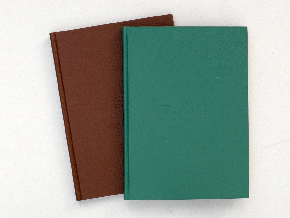
—That red refers to the miniatures; Ana Torf’s book is about the trial of Jeanne d’Arc — Du Mentir-Faux also makes use of medieval type pages and glosses. I do think that colour can say something about the content of a book. I have made two Dirk Braeckman books, the first with a dirty-green cover, the second with a dirty-brown cover; faux leather-like, somewhat dirty, like the second-rate hotels where Braeckman often works. Braeckman takes photos in black&white and the cover shows the colour which is — figuratively — in the photographs.
—When you design a book — I’m thinking mainly of the outside of a book now — what image of the book do you have? Is it an object on a table?
—No. It does not lie on a table — that’s not how I imagine a book.
—Does it perhaps stand upright in a shop window?
—Definitely not, because in that case I would also have to take into account the discolouration or fading of the cover due to the sunlight. I got a lot of criticism for Het blauw van de hemel by Georges Bataille, because the cover was not sufficiently promotional. It is a purely typographical cover, a bit in the style of books by the French publisher Gallimard. People said: no wonder the book doesn’t sell.
—How does the book as an object show itself to you?
—I hold a book in my hand and look at it. I always see the outside of the book in relation to the manipulation of a book — the outside relates to the inside, the content. The cover marks the border between inside and outside, while at the same time making the inside accessible. It sets a development in motion.
—I have a question about the inside work of The Sublime Void. That book was supposed to become a kind of poem of texts and images. Reproductions of works of art — works by Lili Dujourie, Gerhard Richter, Luc Tuymans, Jan Vercruysse, Jeff Wall... — are interchanged with texts by Theodor W. Adorno, Maurice Blanchot, Friedrich Hölderlin, Robert Musil, Marcel Proust... How did you translate the concept of this ‘inter-text’ of word and image?
—Our actual starting point was to make a textual book. That is why I chose the off-white machine-coated paper. Purely white machine-coated paper would have been better for the images; but our first interest was in the text.
—You chose Garamond for the font. Why?
—That was my first use of the Garamond; it’s a nice, calm and classic letter.
—Are there any fonts you particularly like?
—I don’ t have a favourite font, if that’s what you mean. I feel familiar with about fifty fonts, which I got to know in about five years’ time. They’re all reasonably old — at least thirty years old.
—For the bound essays of De Gelaarsde Kat, published by Yves Gevaert, you suddenly use the Walbaum.
—That was a real discovery! I was astonished when I got to know the Walbaum. I thought: nobody uses this, this is going to be my letter! It is not an easy letter; you have to give it time.
—Does the letter say: ‘read this!’
—That sounds dangerous. Still, there are fonts which force the reader to concentrate. You do see the Walbaum more; it is very much present as a grey value. The Garamond is more discrete.
—The type page of The Sublime Void also has a discrete and classic feel.
—Absolutely. A short while before I had discovered Opstellen over typografie (1928) by Jan Tschichold. Tschichold is like a dictator prescribing rules for each typographical detail. He did research into the type pages of medieval books and distilled several rules from this: the space on the inside of the page is smallest; from the top, along the outside to the bottom it gains in width.
—But to do so, the text has to be set in one column — quite classically. That is also the case with The Sublime Void.
—Text should not go in more than one column. You should have a very good reason to use two or more columns. It should mean something, articulate something. For instance, that the text has a different status, that a new type of text starts. In principle, I never opt for using more than one column. I rarely make horizontal books.
—The books on James Coleman and Luc Deleu are horizontal, though.
—In those cases, the choice for the horizontal format was forced by the material. James Coleman wanted to show slides. Luc Deleu’s book is built around his project De onaangepaste stad, which is designed along a horizontal line. For the rest, my books are rarely horizontal. I therefore make few large books; I do not like big books.
—Is that because they remind you of coffee table books or picture books? Is your aversion triggered by those formats?
—No, I think you need to be able to manipulate a book. It should have a relation with your body.
—In Works from 1976 to 1994 by Rodney Graham, you complicate the classic rules of the book. The book is vertical, the font — the Garamond — is classic and the texts are in one broad column, to start with. This, however, changes in the course of the book; it even changes several times.
—The essays about Rodney Graham were set in one column. This is followed by the catalogue raisonné, presented as fiches in a grid, which, in turn, is followed by a first Appendix, the Artist’s Notes by Graham himself, set in a narrower column. The second appendix contains the text by Marie-Ange Brayer in three columns — the text deals with five works by Graham. Finally, there is a third appendix — a typical Graham facsimile of a passage from an English Freud translation. The font stays the same throughout. The types of text are only indicated by the type page — margins and columns — and the font size. I could have used different fonts, but it is my experience that nobody notices. Take, for instance, the Garamond and the Bodoni: to me, there is a world of difference — but people usually don’t see the difference.
—How come?
—No idea. I think people aren’t trained to see the difference. They don’t notice it.
—Which other ways do you have to articulate the content status of materials?
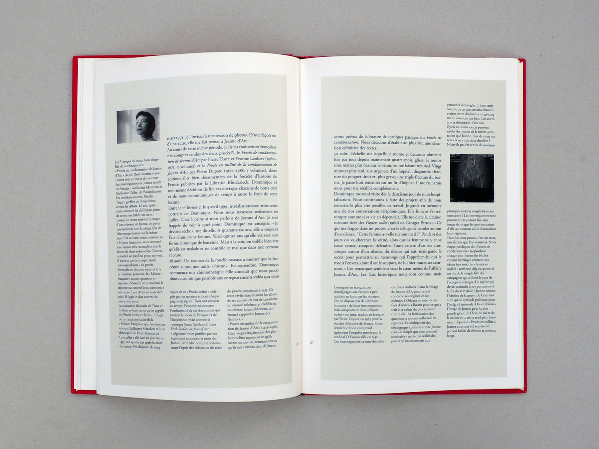
—You can use various types of paper. This is often dictated by the nature of the material — text is better off not being printed on glazed paper, or on extra white paper; photos come out best on glazed paper — but different types of paper can also indicate the status of texts. In the book Du mentir-faux by Ana Torfs we used ‘bible paper’ for the historical, medieval text material added at the end.
—In that book Ana Torf’s text is printed on a lightly coloured background.
—I rarely do something like that. Ana’s text had a special intimate and autobiographical character. It reads like a confession, and the supporting colour makes it into a facsimile: it is as if the text already existed, as if came from elsewhere, and as such was used in the book. It is an image of a text; but I normally rarely use supporting colours.
—Would you set text in colour?
—Never. Text is not meant for that.
—Or use underlining?
—Rarely. It is too formal. There are enough means typical of the book to articulate the differences.
—The margins of Works from 1976 to 1994 contain a very complex reference system. The book is far more complex than The Sublime Void.
—I like complex pages. The most beautiful pages in a book, to me, are those on which the whole machinery of a book come together: quotes, footnotes, notes… I also like comments about comments and the complexity of references, which are all part of the navigation system of a book. Graham’s catalogue raisonné refers to the texts, the essays refer to the catalogue raisonné... Works from 1976 to 1994 is a complete auto-referential system. Graham is obsessed by grammar and the instrumentation of classic books; his editions are sometimes seen as books and distributed as such on the market.
—The appendices in Works from 1976 to 1994 have a strange numbering system: appendix i, ij and iij.
—Those are quire numbers. In earlier days, quires would get separate numbers, in order to avoid the book binder confusing the quire numbers with the page numbers. Graham’s book already had a numbering system for the pages, for the Works, for the explanation accompanying the Works. So I decided to use a quire numbering system for the appendices. I’m now doing the same with the chapters in a book on Thierry De Cordier.
—So you use an element from the old book practice, but give it a new function.
—I take up those elements in order to finetune the navigation system, perhaps also to allow for a more layered reading. This reuse of old means can be dangerous, though, because you can quite quickly end up being formal. But there are elements which used to allow you to find your way around a book, which you could reuse now, in an interesting fashion.
—Could you give some more examples?
—For instance, take the frontispiece. That is an illustration next to the title page, on page 2, which illustrates the essence of the entire book. I like to use the frontispiece in a different fashion, for instance, shifted from the axis. I also like to use the half title, on the first page of the book block. In old books it often used to disappear, because the first page was glued onto the inside of the board. But you can also use that element to lend rhythm to the opening of the book. You can also vary the fonts on the title page. For the book on Maarten Van Severen I made an eighty-page flyleaf.
—What do you mean?
—We extended the idea of the flyleaf to 80 pages, using all the reference material of Van Severen, the designer. The idea was that, first, you would stroll through the reference material, and then enter the oeuvre itself.
—Some traditional components of the book have receded into the background, so they can be used to generate meaning.
—Yes, sometimes noticeably so, sometimes not. Or even invisibly, as in Wim Cuyver’s and Marc De Blieck’s book on the seedy places along motor ways, where gay men go to have sex. Wim Cuyvers and I wondered: what is the seedy side of the book, the ‘clandestine’ location that nobody sees. We hit on the backstrip of the book. You see, the backs of the quires of a book always contain little squares — at the top, with the first quire, and shifting downwards with the subsequent quires. These squares are marking signs for the binder; they are placed there so that the order of the quires is not mistakenly changed. Once the book is bound, these marks are of course invisible. We decided to print the scaled-down plans of the seedy locations on the backstrip of the book — present, but invisible.
—You could read these interventions as commentaries or as metaphors. But they are subliminal or subdued comments. They are not very noticeable.
—That is the point. They are supporting metaphors. People do not have to notice that a column staggers, that there is a shift from the Bodoni to the Scotch. The meaning, as it were, is below the page.
—Could you say the the effect is lost once it is noticeable? That is then becomes a ‘special effect’?
—Yes, that is exactly the mistake I used to make before 1993. Later on, I made a book for Michael Snow, in which the text column slightly staggers per page. At first it is on the left, at the end on the right. Nobody notices — but they don’t have to.
—What if you do literally invisible interventions, like the book by Wim Cuyvers and Marc De Blieck? Is this the fun of the disappearing trick?
—Well, you really say: the design should be subliminal, it should work below the pages.
—In making use of these interventions you also query the limits of the book, in a very tangible way. It sounds avant-gardistic, but you do query the limits using older means: you use the means of the old book to break into the current book.
—I try to search for the limits of the book using elements typical of the book itself. If you use traditional, typical elements of the book, you can make statements on a book with very small interventions. Yet, the book remains accessible and readable.
—Would you say that you have rediscovered the negative force of conventions — a bit like Rineke Dijkstra in photography? She, for instance, photographs four young people in the Vondelpark in such a tight, classical manner that each detail — from the fluorescent bracelets to the plastic bottle in the grass — is accentuated.
—Right. The classical idiom is a powerful thing. In a classical grid you can make minimal changes, shifts; you can stretch or strengthen details. This immediately generates meaning.
—How do you link the ‘typical of a book’ with the spatiality of a book? Because you say that the book is essentially also a space.
—In a building you walk through spaces, you go through them quickly or slowly. You can go forwards or retrace your steps. You can also skip spaces. In a book something similar happens: you leaf forwards or backwards; there is a route — like in an exhibition — and you appeal to your memory: if you turn a page, the image that was on the previous left page stays on your retina. I often use that memory factor.
—Does the book also have an elevation, like the front of the building? Is the book essentially vertical?
—I wouldn’t say that.
—Because you usually make vertical books.
—No, a book always has a vertical and a horizontal dimension; the horizontal dimension is to do with leafing through and reading. In short: with time. I always try to break through the plainness of the book. It is only by working with time that space can become an element of the book.
—How do you organise time? How do you design the book as a whole? For instance, The Sublime Void.
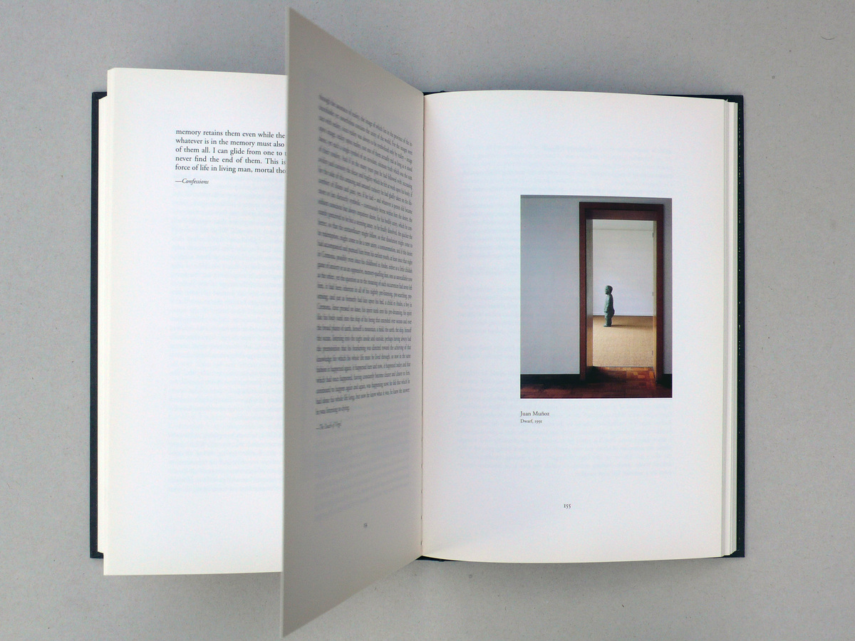
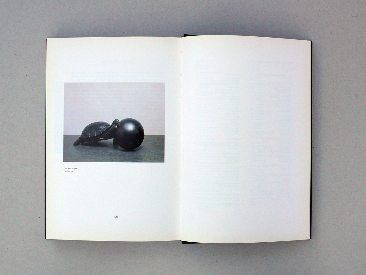
—Our method was very classical. We printed everything and laid out the book on the floor. Then we started to do the jigsaw. We sometimes ended up with very expressive combinations, like with the figurine of Muñoz, which seems to look behind the text, as if looking behind a wall. Of course, the last image of The Sublime Void was also chosen very intentionally: Jan Vercruysse’s turtle pushing a sphere out of the book.
—So you start with a kind of map —the difference with a building being that you can’t enter various adjoining spaces from one space; the order of the pages is coercive. Plus in the book each space — each double-page spread — is equally large.
—You can work with fold-out pages. But, of course, a book is not a building. When I stroll through an exhibition, though, I often have the feeling of moving through a book. So there are parallels.
—How can you describe the global structure, the plan of a book, in book terms? Perhaps as a sentence, a period? Are the marks and sections within a book, the cuts which give rhythm to a book, the punctuation marks of the designer?
—There are typographical means to indicate that you are entering a new chapter; you can also use big and small cuts. In that sense you could talk of punctuation.
—Which element could function as a dash?
—The Rodney Graham book has an image — a typical facsimile of a cover — which was inserted in the text for the sake of repose. The image is not completely detached from the text, but is nonetheless fairly autonomous. That does indeed work somewhat like an aside.
—Could glosses in the margins work like brackets in a text?
—That’s an interesting comparison. I have never looked at it in that way. I myself always use the image of a musical course in time. You start with an ouverture on entering, then there are a few accents, at a certain point there is an intermezzo, and at the end all’s well that ends well; the book finishes.
—Can you also translate the idea of punctuation or musical segments to quires of images — a purely image-based text?
—Yes. Take Dirk Braeckman’s photo book z.Z(t)., which is made up, exclusively, of full-page photographs. We made sequences of horizontal and vertical images. Each junction, where they alternate, is marked by an image which — very pointedly — either ‘lies down’ or ‘stands up’. In that way, the transfer is clearly articulated. That, too, is punctuation.
—Another element of rhythm is found in the images of the booklet on Lili Dujourie with the exhibition in the Lisson Gallery. You alternate black&white photographs with colour photographs. Is that use of black&white a conscious choice?
—Definitely! I believe that black&white works in a book. Too much colour on a page is contraproductive. It is often even enough to use one colour image — the colour is, as it were, carried through in the subsequent images. Walter Nikkels, a great example to me, made a booklet about the commune of Viennese Actionist Hermann Nitsch; on a number of pages he uses one image in colour — autumn colours. That one image colours the entire series of landscape pictures.
—But a conscious choice for using black&white also implies a certain perspective. It accentuates the historic character of an image; it could pull an image towards the margins of a text.
—An image in black&white appears as an image; not as the thing itself.
—How do you treat image material which is not typical of books, such as film or video stills?
—In a booklet on the videos of Lili Dujourie we tried to avoid the illusion of a continous movement. We looked for combinations which would create something between the images — for instance, by contrasting camera angles. Lili wanted to show as few images as possible. Two stills were sufficient to evoke one video work.
—Is it that you didn’t want to transfer the film onto book?
—That’s right. However, I do believe that you can make a film enter into a book. That was my experience with De neef van Beethoven, the book which Ana Torfs published with her Beethoven film Zyklus von Kleinigkeiten. That book has an existence in its own right, next to the film. Instead of stills, it contains photographs which Ana had made during the filming, from the same camera angle. The images perfectly fitted into the logics of the book. In a certain way, film can happen in a book, just like an exhibition can take place in a book.
—I have noticed that you have not made many books about the ‘real’ art of painting.
—Painting is a difficult art. Everyone looks at the original. You almost have to take an obsessional approach to this original.
—Perhaps the difficulty also lies in the specific materiality and surface quality of some painting; that plane is so manifestly different from the material plane of a book and a page.
—But it can be done. It is a question of making choices. Perhaps I haven’t been presented with the right question yet.
—What could be ‘the right question’?
—That someone doesn’t just want a book with paintings, but also wants a book with those paintings. Because that is a completely different exercise.
—